Instagram Thumbnail Design Tips: Boost Engagement with These 5 Tricks
Instagram Thumbnail Design Tips: Boost Engagement with These 5 Tricks
How much time do you think the average person scrolls through social media each day? The latest stats show it's around two hours and 23 minutes 1! In that vast sea of content, especially on a visually-driven platform like Instagram, your thumbnail isn't just a preview – it's your hook. It's the cover for your Reels, the first glimpse of your videos, the face of your Guides. Getting it right is crucial to stop the scroll and boost engagement.
Yet, many creators treat thumbnails as an afterthought, letting potentially impactful content get lost. Ready to ensure your content grabs the attention it deserves? Here are 5 actionable tricks (and common mistakes to avoid) for designing Instagram thumbnails that demand a click.

1. Master Visual Consistency (Build Brand Identity)
Consistency breeds recognition. When your thumbnails share a coherent style – using the same color palette, fonts, or logo placement – your audience learns to spot your content instantly. This builds trust and familiarity.
How to Do It:
- Establish Guidelines: Create a simple brand kit: define key colors, 1-2 highly readable fonts, consistent logo placement (if used), and perhaps a recurring layout element.
- Use Templates: Develop basic templates for Reels, Videos, and Guides to ensure uniformity and speed up your workflow.
- Stay Cohesive: Ensure your thumbnail aesthetic aligns with your overall Instagram profile and brand identity.
Common Mistake to Avoid:
- Style Chaos: Randomly using different fonts, colors, and layouts confuses followers and dilutes brand impact.
- Over-Complexity: Trying to cram too much into the design makes it hard to understand at a glance.
The Benefit: Stronger brand recall, a more professional appearance, and instantly recognizable content that encourages clicks from your community.

2. Use Bold Text Overlays Wisely (Ensure Clarity & Spark Curiosity)
While a picture is powerful, a few well-chosen words on your thumbnail can provide essential context or spark immediate interest, especially crucial for Reels and video covers.
How to Do It:
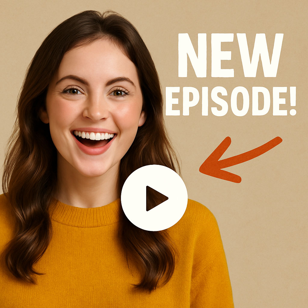
- Keep it Punchy: Aim for 2-5 impactful words. Think headline, not essay.
- Prioritize Readability: Choose bold, clear fonts. Ensure high contrast between the text and the background (use light text on dark areas, or vice-versa, perhaps adding a subtle text background shape for clarity).
- Tease or Inform: Ask an intriguing question ("Secret Weapon?"), highlight a key benefit ("Double Your Views"), or hint at valuable content ("3 Easy Steps").
Common Mistake to Avoid:
- Text Overload: Too much text makes the thumbnail cluttered and unreadable, especially on mobile.
- Illegible Fonts: Using decorative or thin fonts that are hard to decipher quickly.
- Obscuring Key Visuals: Placing text directly over important elements like faces or products.
The Benefit: Provides instant context or creates curiosity, compelling users to stop scrolling and engage.

3. Prioritize High-Quality, Compelling Imagery (Create a Visual Hook)
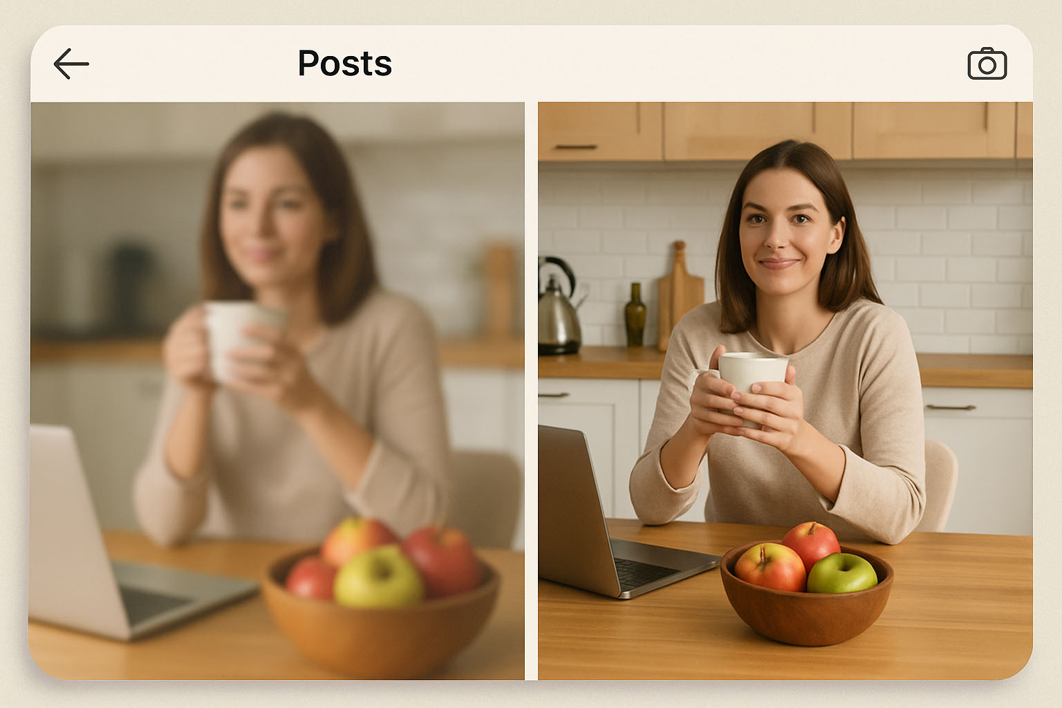
The image is the heart of your thumbnail. Grainy, poorly lit, or irrelevant visuals look unprofessional and are easily ignored. Aim for sharp, engaging, and relevant imagery.
How to Do It:
- Go High-Resolution: Always start with clear, well-lit photos or graphics. No pixelation!
- Feature Interest Points: Human faces (especially showing emotion) are natural attention-grabbers. Alternatively, showcase the most visually striking or intriguing aspect of your content.
- Keep it Clean: Avoid busy backgrounds that distract. Use basic editing tools (like Instagram's built-in options, or apps like VSCO/Snapseed) to adjust brightness, contrast, and sharpness. For generating unique visuals or enhancing existing ones efficiently, AI tools like ThumbMaker.ai offer powerful features to create eye-catching base images.
Common Mistake to Avoid:
- Low-Quality Source: Using blurry, dark, or poorly composed original images.
- Visual Noise: Cluttered backgrounds that make the main subject hard to distinguish.
- Irrelevance: The thumbnail image doesn't accurately reflect the actual content.
The Benefit: High-quality visuals command attention, convey professionalism, and make your content significantly more attractive.
4. Design for Multiple Placements (Ensure Adaptability)
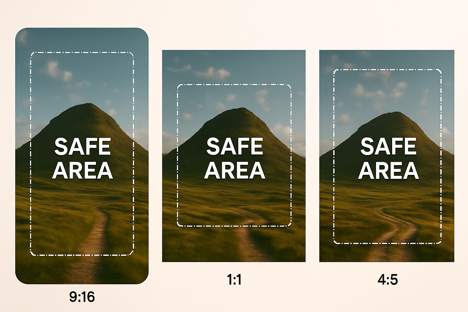
Your thumbnail appears across Instagram in various shapes and sizes: the square (1:1) or vertical (4:5) feed preview, the tall 9:16 Reels/Stories view, video tab previews, and Guide covers. A design optimized only for 9:16 might lose impact when cropped.
How to Do It:
- Mind the Safe Zones: Position essential elements (text, key subject, faces) within the central area, particularly the center 1:1 square, to ensure visibility in most crops.
- Know the Ratios: Be aware of common displays: Feed (1:1, 4:5), Reels/Stories (9:16). Design primarily for the initial placement (e.g., 9:16 for Reels) but keep crop-safety in mind.
- Quick Preview: Before publishing, mentally check: If cropped to a square, is the core message still clear?
Common Mistake to Avoid:
- Edge Creep: Placing vital text or imagery too close to the edges, guaranteeing they'll be cut off in some views.
- Designing in a Vacuum: Creating a 9:16 masterpiece without considering its appearance as a 1:1 feed preview.
The Benefit: Guarantees your thumbnail looks great and communicates effectively, no matter where a user encounters it.
5. Imply a Call-to-Action (Guide the Viewer)
A great thumbnail doesn't just sit there; it invites interaction. While not usually direct links, the design itself can strongly encourage users to watch, read, or engage further within the app.
How to Do It:
- Use Subtle Visual Nudges: Stylish arrows (use sparingly!), highlighted results, or intriguing visuals (like a 'before & after') can guide the eye and imply value.
- Text as CTA: Your text overlay often serves this purpose directly (e.g., "Tap to Watch," "Learn How," "Recipe Inside").
- Promise Clear Value: The image and text combined should make the benefit of clicking obvious. What problem will be solved or what value gained?
Common Mistake to Avoid:
- Vagueness: The thumbnail offers no clear reason why someone should engage.
- Passive Design: No visual or textual cue suggests the next step for the user.
- Clickbait Without Delivery: Hinting at content that isn't actually provided, which erodes trust.
The Benefit: Transforms a passive preview into an active invitation, increasing the likelihood of clicks and deeper engagement.
Bonus Tip: Leverage AI for Efficiency
Consistently creating optimized thumbnails requires time and attention to detail. AI-powered design tools can significantly streamline this. Platforms like ThumbMaker.ai are built on best practices, helping you generate multiple design ideas rapidly, maintain brand consistency, optimize text overlays, and select compelling visuals, freeing you up to focus on your core content creation.
Conclusion: Make Every Thumbnail Count
Think of your Instagram thumbnails as tiny, powerful billboards competing in a crowded space. By mastering consistency, wielding text overlays wisely, prioritizing high-quality imagery, designing for adaptability, and embedding an implied call-to-action, you give your content the best chance to win attention.
Simple changes, like standardizing Reel covers using these principles, have helped creators boost views significantly. Similarly, adding clear, benefit-driven text overlays has increased engagement for businesses on video posts. Don't let weak thumbnails sabotage your hard work. Implement these strategies, consider leveraging tools like ThumbMaker.ai for efficiency, and watch your Instagram engagement climb!
References
Footnotes
-
DataReportal. (2024, January 31). Digital 2024: Global Overview Report (citing GWI data, which reveals the “typical” social media user now spends 2 hours and 23 minutes per day using social platforms). Retrieved from https://datareportal.com/reports/digital-2024-global-overview-report ↩